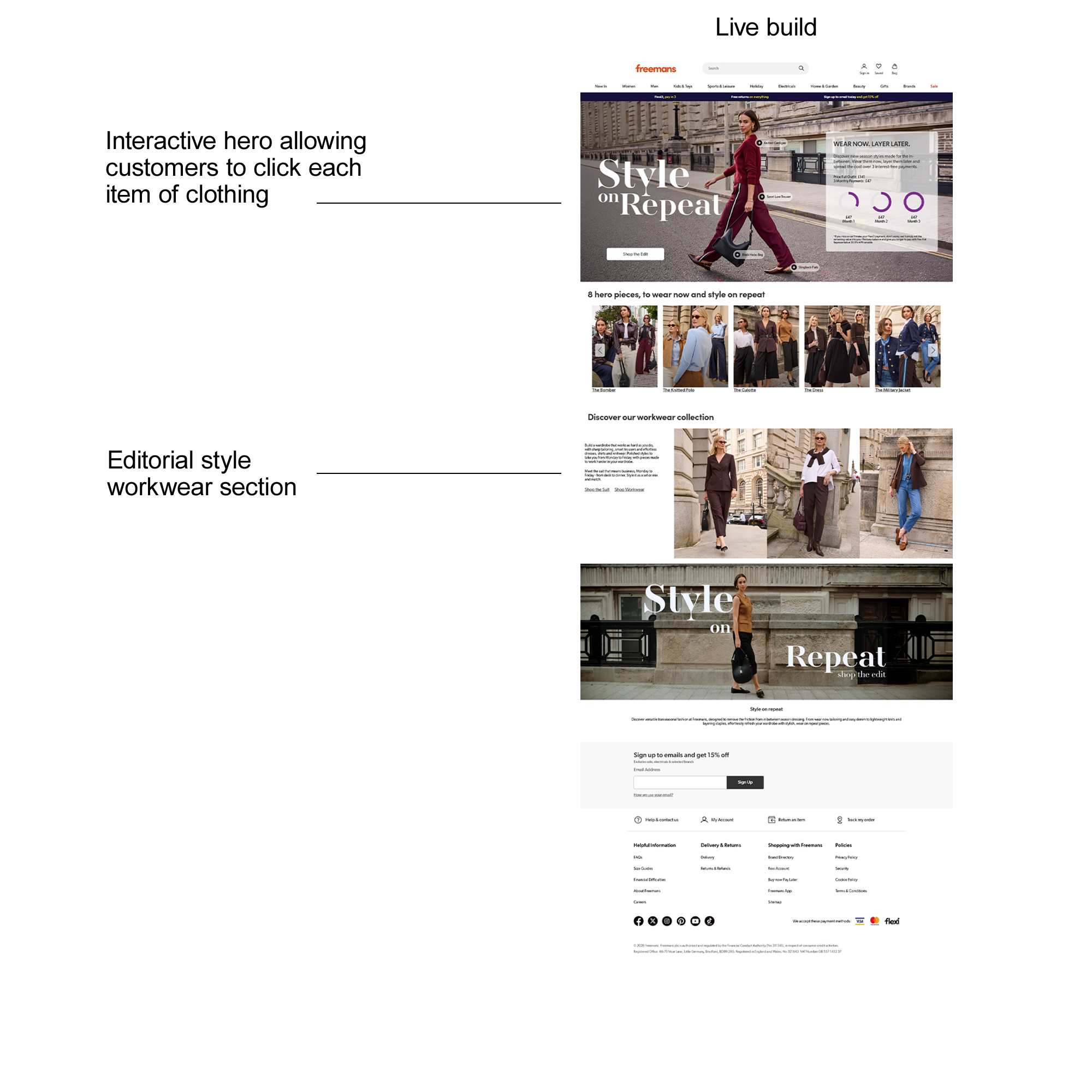
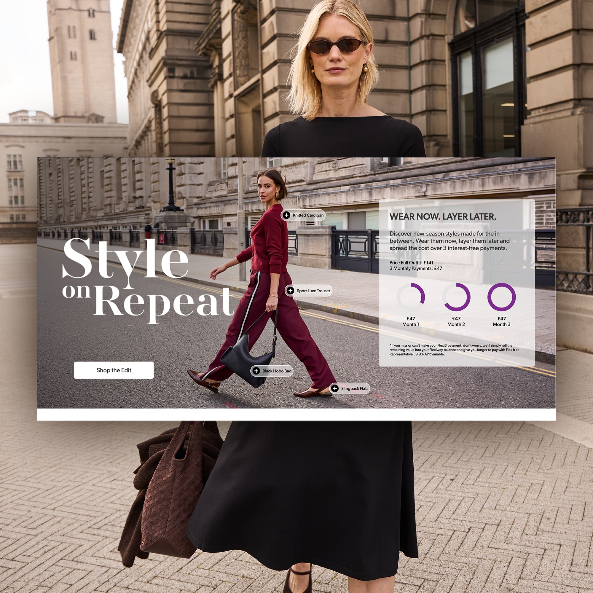
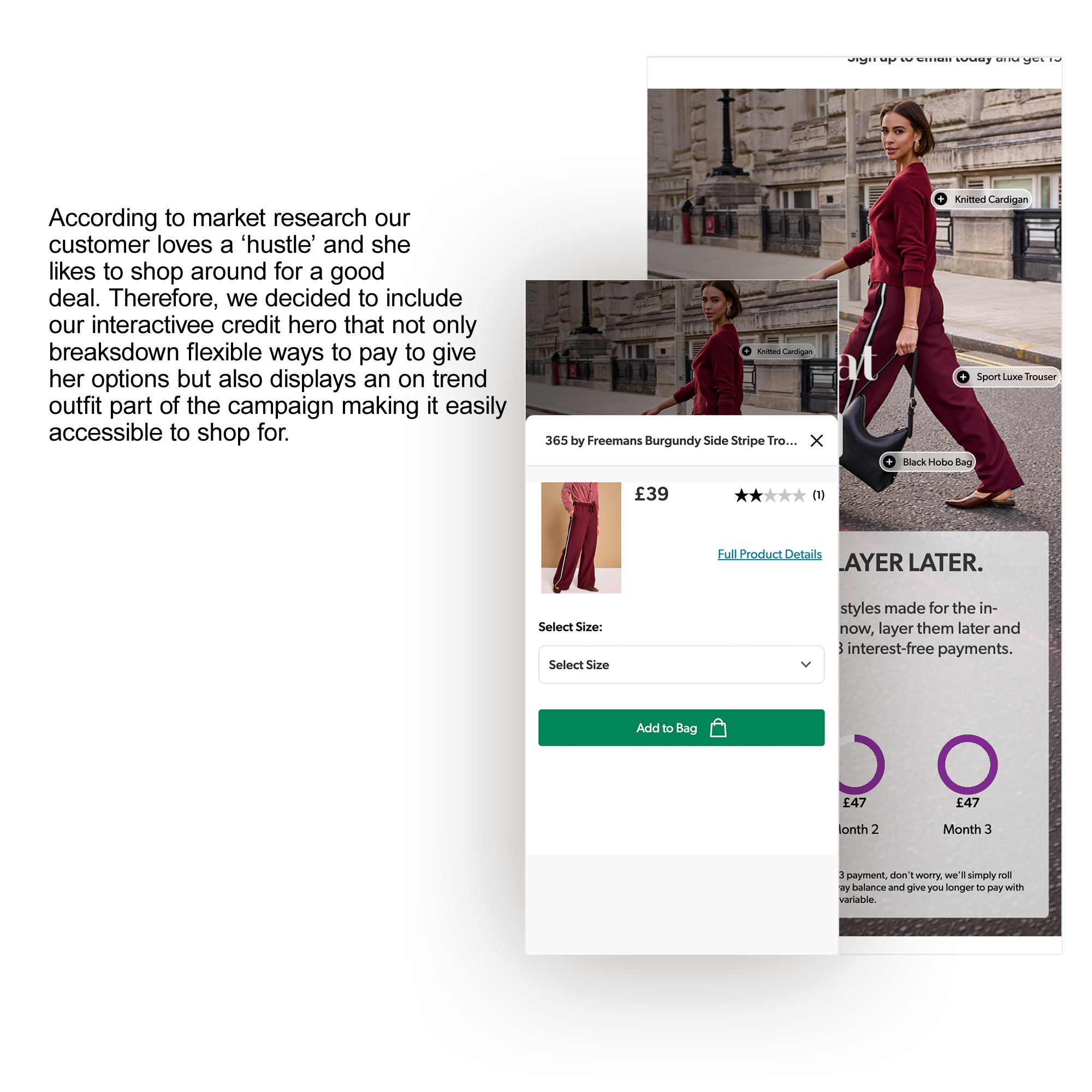
The initial landing page concept was designed by a colleague, establishing the campaign's visual direction and page structure, approved by stakeholders. Following some last-minute changes to the campaign requirements, including a decision to reduce the overall page length, I revisited the wireframes and adapted the layout to reflect the updated direction. Once the revised approach was approved, I took the design forward into development, maintaining the original visual direction while adapting elements where needed for the final responsive experience.
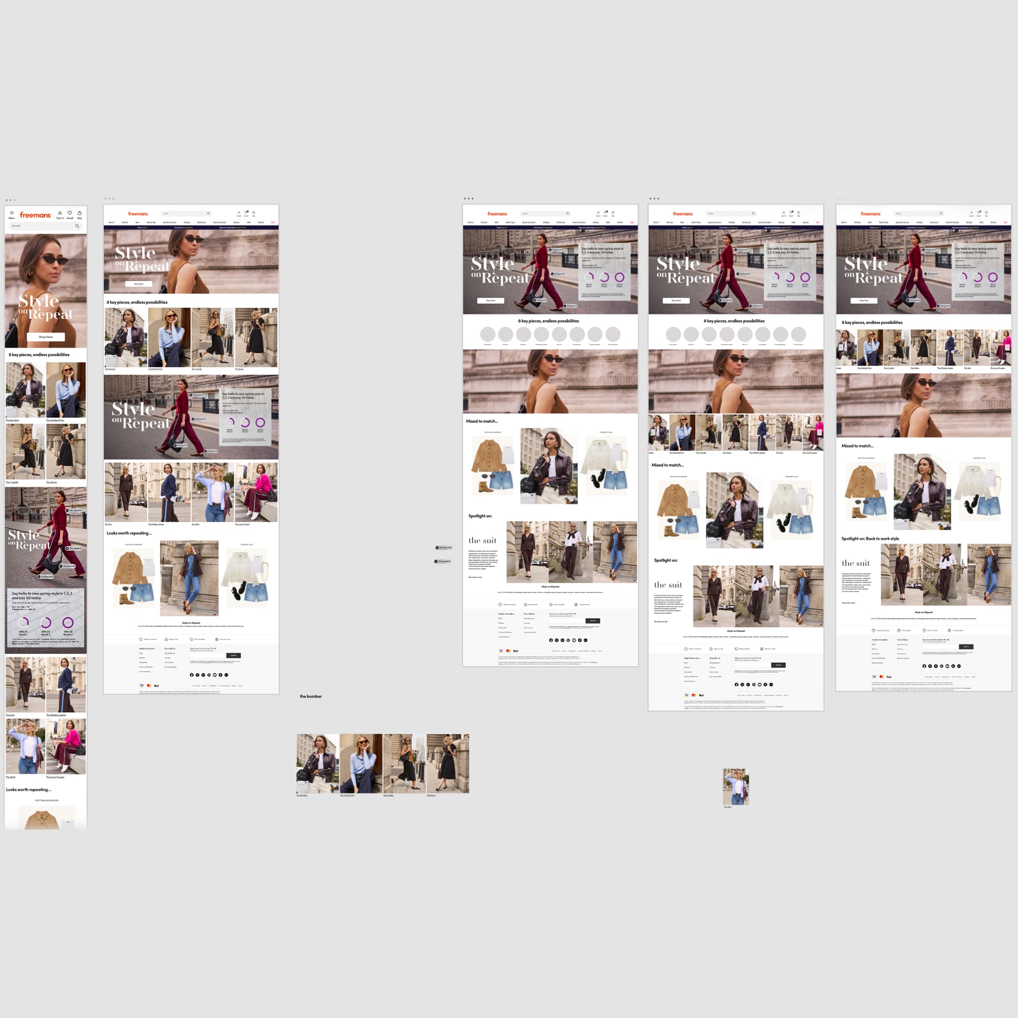
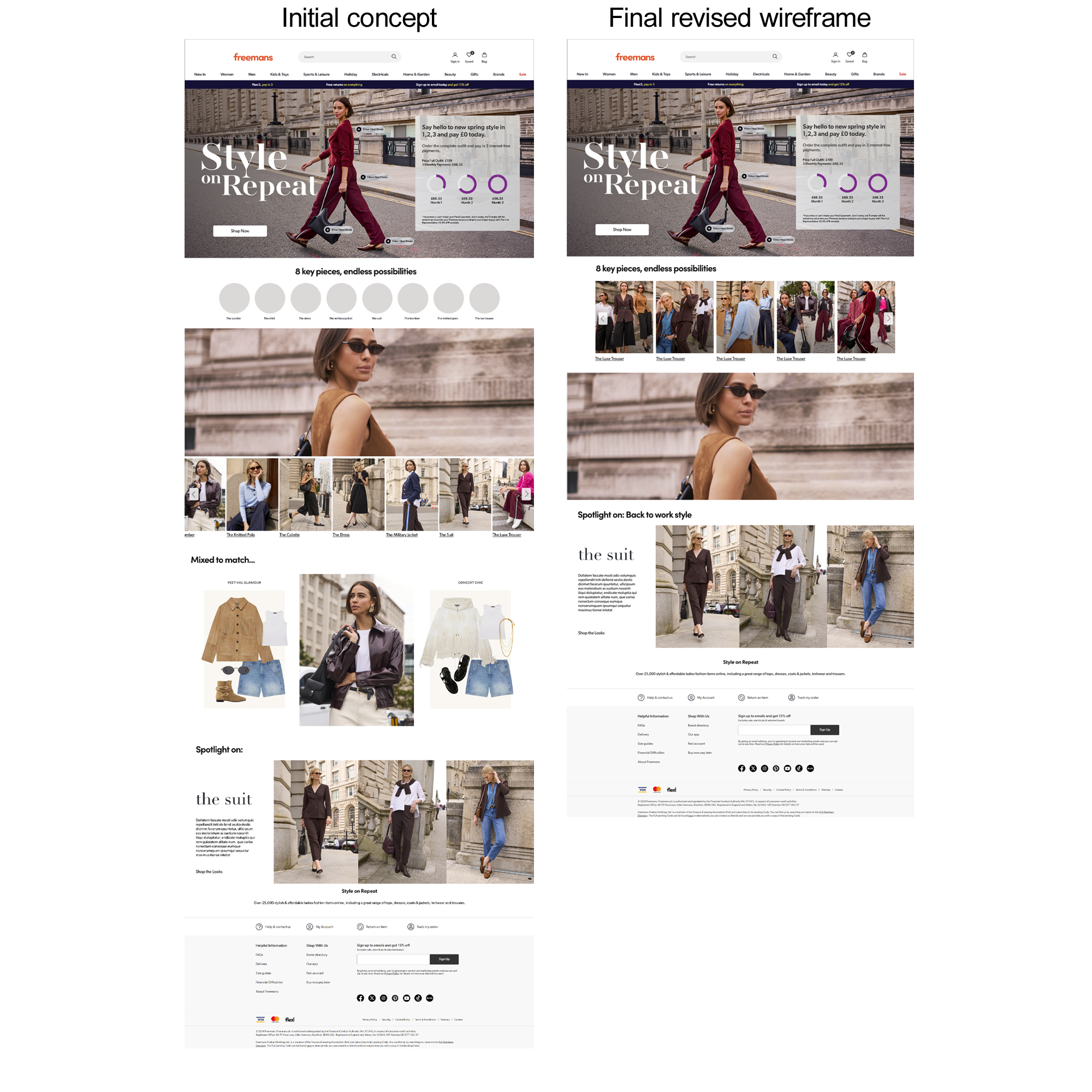
As shown in the revised wireframes, the layout evolved slightly, replacing the original product spotlights with a full-image carousel. This allowed each key product to be presented across multiple looks, highlighting the versatility of each piece and the different ways it could be styled. We also removed the Mix & Match section, which was considered more of a ‘nice to have’ and contributed to unnecessary page length. This helped create a more focused and streamlined landing page experience.
The approved wireframe provided the foundation for development, with a few minor refinements made during the build to ensure the experience worked effectively across different screen sizes. The carousel was limited to five slides, as including more products caused the imagery to scale down and lose visual impact. I also moved the campaign video to the bottom of the page, as it was primarily a supporting visual rather than a key source of information. This helped maintain a clearer content hierarchy, with the core campaign messaging and product content prioritised earlier in the journey.
Visit page ↗